Sunday, May 03, 2020

Tale-ing Fragments #8: Use Your Wings

As you know, my Tale-ing Fragments usually have some text in them, but this time I didn't want to add anything, I love imagining their conversation differently each time.

It can be anything from 

"Stormy weather today, isn't it?" 
or 
"Thanks for the ride old boy! How about a cup of tea before you go?" 
to 
"Is that what you're wearing?..."  

Imagining it is too much fun so I didn't want to confine it with words :)


I will say it was a challenge finishing this one, I actually had it finished yesterday but... something wasn't right, so I left it overnight and re-visited this morning. I re-tinted Frederik's suit (that's his name in my head, feel free to rename him in yours), mounted the whole image on a black backing and in a clear whimsy attack added the 'fluff' clouds, now I'm happy! It's amazing how much this tiny bit of texture adds, and though somewhat weird... well, it works *shrug*

The project started when I played with Distress Leather Paper after another brilliant Tim Holtz's demo, where he used Resist Spray to give the colored leather paper shine. The texture immediately made me think of a dragon (it might be related to my watching Flight of Dragons again just the day before - love this movie!) and so I got to work on the dragon (and yes, he does have a name, but it's pretty unpronounceable for humans... He doesn't mind me calling him Sir Peter though, so he'll probably forgive you too).
This was the original sketch, as you can see, some of the details changed, but I'm definitely happy with the final incarnation, the texture of the leather paper is perfect!
From this sketch I made the layers that make up the dragon face. The eye alone is four parts, it's a lot of work, but it was worth it to get the expression, I like that he looks kind :)
Once done, it was clear we have a chatty fellow and that he should have some company. So I dug through my Paper Dolls and found this lovely gentleman and a Steampunk adventure was born.

I'm not sure what their job is exactly (they wouldn't say), but these two fly every night to mysterious posts where Frederik makes sure the machines are working properly. This post was make with Tim Holtz Kraft-core metallic paper, Foundry 3D embossing folder, and many stained and glazed gears. I usually put more dirt and patina on my mechanics, but Frederik was huffing that nothing under his responsibility would look that bad...

Hope you enjoyed meeting Frederik and Sir Peter, it was definitely fun making this scene :)
I'm entering them to the May 2020 SanDee&amelie's challenge (can you believe it's May already??), do check it out for all the amazing inspiration from the team and participants - it's so much fun!
SASPC Blog

Hope you're all doing well, stay safe, (try to) stay sane and enjoy some wonderful dreams ;)
xx
Naama

Tuesday, April 21, 2020

Tale-ing Fragments #7: Nature's grace & beauty


"With shining eyes she noted all of nature's beauty and grace."
  
Like my former post, this project brings together the results of trying out different materials and techniques. The first part I made is actually the small frame in the center. It's a Baseboard Lace Frame I altered with Distress Crayons and Glazes, it's pretty amazing to think it started in pale cream-color. I particularly like the silver shimmer created with Brushed Pewter crayon.
I usually alter elements like frames to fit whatever it is I want to frame, so it was a little strange for me to do it the other way around, but I went through my stash and found this lovely lady. Then I looked through my recent experiments for a background and found a bright green one with botanical images and the story was set in my mind. Does she not look like she's listening? Observing? 
I had to remake the background because the piece I had was too small, which gave me the opportunity to play with the imagery. I started with Yupo synthetic paper and created a mix of greens with alcohol inks. Then I used Tim Holtz's Entomology stamp set and Alcohol Lift-Ink pad to create ghost images of insects and writing. The lifted handwrite was stamped on the photo around our studious lady. When I was happy with the alcohol ink background, I added Collage Paper over it with the technique Tim has shared in a demo last week using Resist Spray. The spray creates a shiny finish that deepens the colors and, because the lifting creates white images, the black images on adds depth and interest.
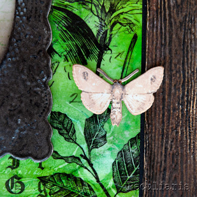
For some extra spots of color I stamped, colored and cut some of the Entomology images. The cicada was especially fun because I could place it next to the ghostly lifted image! Since I didn't want to block too much of the background (it has big wingspan!) I stamped the image on acetate as well and added the clear wings to the body, I really like how dimensional it all becomes.
I chose to add a moth instead of a more colorful butterfly because it's delicate coloring fit better with the colors I used to tint the photo and the text strips.
The final part was making the frame. It wasn't planned, at all, but I felt a frame was needed and could not find one in the right size, so I decided to try and make one! I used a similar technique to the one I shared in my last Tale-ing Fragments post, but with Woodgrain Cardstock and I really love the results! I'll definitely make more frames from no on, it's just so convenient!

I'm entering this project to the Simon Says Stamp Monday Challenge that has a 'create a scene' theme. I figure it fits since it is telling a story, albeit a fragmented one ;)
SSS Monday Challenge Blog
Hope you enjoy this little walk-through, I'd love to hear what you think and as always feel free to ask anything!

Keep safe and keep your spirit up,
xx
Naama


Sunday, April 12, 2020

Mechanical Blooms

"Bloom where you are Planted"

I think that the idea behind this saying is very fitting for our current time, the covid-19 situation has placed us all in uncharted territory on some level, be it working from home, not going outside or meeting the people you love. It's all so confusing, but the best we can do is keep positive and try to make the best with our time.
Like many artists and crafters I found that I have more time to experiment, play around with materials without really thinking or aiming for a specific outcome. The project I'm sharing today came about as I was experimenting with different techniques, I'll try to break it down a bit.

The background brick wall texture was made using a variation of the Distress Glazes & Crayons technique Tim Holtz shared in his (now becoming regular - yay!) Saturday demo about two weeks ago that focused on Distress Crayons. I used it over Texture Paste applied through a brick stencil and I love the results! (I was asked to make a tutorial for this brick wall variation, you can find the video in my Facebook page here). I cut out the brick texture to the size I wanted and adhered it to my background, in the final stages I added a bit of moss 💚 

The flowers were actually inspired by a stamp image of a flower made from metal plates. If you follow me on social media you know I've been making paper flowers for a while (usually tiny ones), I thought why not try make a metal-paper flower? I used embossing folders for the petals and electric wire for the stem of two flowers, the third I just nailed down 😂


I'm still working on this idea, but for now - definitely like these whimsical blooms!

I wanted to add a message, but when I put down a sentiment strip it just didn't fit, it felt too detached from the quirk-celebration going on, so I decided to play with it :)
I cut the sentiment in gold letters and then cut a whole lot more letters in black and scattered the letters of the message between random black letters. The message is still readable, but you might need a moment to piece it together, so it becomes more a part of the background than a focal point. The black letters are barely visible at first, but it's surprising just how much these kind of details add to the final piece.


I'm not sure I covered everything, it's a small piece (20x15cm) but there's a LOT going on! If  missed something - feel free to ask! ^^

I'm entering this project in two challenge blogs: the Simon Says Stamp Monday Challenge Blog that has a texture theme this week, and the Sandee & Amelie Steampunk Challenge Blog that extended their March challenge to give us all some more time to play :)
SASPC Blog


SSS Monday Challenge Blog

Hope you enjoyed this project, keep safe and keep that smile on your face :)
xx
Naama


Tuesday, March 31, 2020

Tale-ing Fragments #6: She Dreams + Varnished wood tutorial

"She dreams of faraway places and daring adventures.
Her eyes gleamed with the first step in the journey"

It's been a while since I made one of these fragmented story-collages, I had so much fun! Part of the fun in this particular project was the combination of using older technique-testers and the accidental discovery of a new technique - a yummy varnished wood look! (tutorial below).

What started me going was a Steampunk theme challenge in two blogs, the SanDee&amelie's challenge blog and the Simon Says Stamp challenge blog that also had a Steampunk theme (I actually missed the deadline for the later, so will be entering this work to the Anything Goes theme challenge Simon has on their Weds challenge 😅).

Like many of us these days, I've been at home a LOT, and I used some of this time to play with craft supplies, so I wanted to incorporate some of my trials in this piece. The large mosaic-like image in the back was done with the distress crackle-paste + embossing glazes technique shown by Tim Holtz & Stacy Hutchinson a couple of weeks back. The nautilus piece below is from playing with alcohol ink lifting. I did not expect them to work well together, but it's always a great surprise when that happens. I then picked a paper doll and found her story in my mind - doesn't she look like she'd be a great adventurer? Not the flashy kind, a clever time-traveler that can go, observe, learn and come back without causing a mess.
Clearly she needed a Steampunk\time machine.
My association of Steampunk includes, beside the industrial grunge, also the slick decorative Victorian style design that had polished wood and glass elements beside the iron and steel. I was thinking of how to get that polished wood effect when my eye caught my Distress embossing glazes - would it work? It did! I was so excited with the results I had to share them and some kind fellow crafters asked me for a tutorial - challenge accepted! And embedded below, but first, a few more details of this lovely adventurer and her machine:


I love how the stained gear fits with the nautilus pattern, in some angles it almost disappears!

Now for the promised tutorial:


This is my first attempt at making a video tutorial, so I hope it's clear enough...
If you have any questions about the video or anything else in the project please feel free :)

If you're looking for more inspiration take a look at these wonderful challenge blogs, they always have amazing inspiration and treasures in the entries
SASPC
SSS Wednesday Challenge
  
For now, a shiny farewell

xx

Friday, March 27, 2020

Muses #1: Alterman's Moon

We all have muses in our lives: poems, movies, books, a sentence that caught with us and stayed around. One of mine is this poem by Natan Alterman (1910-1970) titled "Moon":
* Based on a translation by Lewis Glinert.

This poem was written in 1938, it's one of Alterman's best known works an much can and has been be said about it. For me, reading it years back, I was left with two main impressions: the idea that a familiar, everyday sight can seem new again and the visual of a moon at the spear of a cypress tree. (Alterman talks of a Mediterranean cypress, Cupressus or "Brosh" in Hebrew, that is characterized by a tall and narrow canopy that is often spear-like in shape). I've often found myself reminded of this poem when seeing just this sight: the moon at the point of a tree, and it always made me smile because it felt fresh and wondrous, no matter how many times I saw it :)
I love this poem always, but in these crazy times it warms my heart even more. It's not without poignancy, but it expresses wonder before minute, everyday things that we usually don't acknowledge, and I think that within the craziness and uncertainty we currently live in it's more important than ever to remember the little things that make us smile.
So look out your window tonight, find the moon at the point of a tree and smile back at it 🤍

This collage was in my head for a while, working out how I want it to look when, a few days back, I saw a demo of the paints I used (Distress Crayons, demonstrated by the one and only Tim Holtz) and bam - I knew they would be perfect!

I wanted the background to have the lyrics repeatedly, so I printed them on the blank Collage Paper (my new best friend in collage making) in different font sizes and scattered them about. Then I colored over the background with Distress Crayons, they gave the exact vivacity I was looking for while keeping the text visible. The tree is an Idea-ology half-tree that got a tint and a new hairdo to look like a Cupressus tree. The lovely moon was made with alcohol inks - I love how textured it looks!


For the trail I used the new Distress Glazes + Crayons technique Tim shared in his demo that creates all these little pits, isn't it the coolest??


This was one of these projects that took a lot of time hibernating in my brain before I started working, and maybe that's why it didn't take very long to finish. It's nothing too fancy, but it's close to my heart (and already on my wall). I felt like sharing it, so aside from posting it here I'm entering it to the Simon Says Stamp weekly Wednesday Challenge, which has an Anything Goes theme this week.

I hope this project will give you a smile, keep safe and find the little things that make you happy,

xx
Naama


Friday, March 20, 2020

Vintage-ing a LED Lantern

 Hi all ^^

This was a fun little project I thought I'd share, it only took me half a day or so (including waiting for paints to dry - so very quick!) and it's such a HUGE difference.

I got the lantern in Ikea, this is what it originally looked like:
Cute right? It's actually pretty nice for a piece of plastic, but I saw immediately that it had potential for so much more ;)

The first thing I did was cover all the black parts in Collage Medium, even though it's a glue it works great as a primer for sleek\non-porous surfaces. Then I started adding details to make the lantern look more authentic.
I removed the string from the top and replaced it with wire, then I drilled a hole at the top of each side-handle and added a long wire handle. I also wrapped a wire around the lamp part, which I connected at the bottom by drilling two small holes and inserting the edges. the wires are all a bit crooked, but hey - it's supposed to look vintage right? ;)

The last wire detail was a small lever that I inserted at the bottom part into another little hole I drilled. next to it I glued die cuts of numbers. I cut them from black cardstock to save on painting them, but really it can be any color.
On the other side I added a little knob. This is supposed to replicate the opening where they'd add oil, and it's was the hardest detail to find. I tried a lot of options and ended up using some rubber part I got from an old computer I took apart (I think it was meant to keep some parts in place, but not sure...). I think it looks pretty good, but it so funny when you touch it and realize it's rubber 😂
The lantern already looked pretty authentic once everything was glued, and I could just leave it in black, but I really wanted to rust it up ^^
I added Finnabair's metallic waxes to the black to create a metal base and then used her Rust Effect Paste trio - I LOVE this stuff! It took some layering and playing (and waiting), but finally I was happy with the rust illusion.
To finish it, I added some highlight with the waxes and a bit of patina with Tim Holtz's distress paints in blue and green. It was barley a drop of paint on the whole thing, but it's amazing what difference it makes!

I liked the results so much I decided to add it to the SanDee&amelie's March 2020 Steampunk Challenge, there are some seriously amazing works there so do check it out!

Hope you enjoyed this little project! Now excuse me while I go look for other things to 'rust-up' ;)

Have a great weekend and take care xx


Monday, March 16, 2020

Guardian of Lost Souls

Between this world and the next they hover aimlessly, lost but not alone. Some carry the sadness of their departure, others harbor hate and foster wrath over their unjust end. In that fine membrane between worlds they hover under the guardian's watchful eye.
But who is he guarding? Us or them?
Those of you that follow my Instagram or Facebook already know this work, but I felt like sharing it here where I can get a bit crazy with detail shots ;)

This piece is definitely one of those 'a simple idea that escalated' cases.
It started with the skull, I wanted to see how dimensional I can get this paper die-cut, and I was really happy with the results. It's pretty amazing what some forming and ink can get out of flat paper!

I knew this skull deserved to be the center of something special, and from the beginning had the idea to have it's eyes glimmering wickedly  (muwahahaha), so I decided to use LED lights. If you're familiar with these light strings, you know that they are pretty long, so I started thinking how I can use the rest of the lights in the background and it came to me - ghosts!
I dug through my stash of Tim Holtz Paper Dolls and found all the 'disfigured' ones - they come cut out in detail, and every now and then the cutting isn't exact and something get cut off, you can see the girl and man in the photo bellow have part of their head missing. It's very rare to find a Paper Doll this off so it's lucky I have quite a stash ;)
 For the lighting to work the background has to be translucent, but not clear so the light is diffused. I used Tim Holtz's alcohol inks and pearls on acetate. The mica in the pearls makes them more opaque, so when the lights are off it kinda looks like shimmery dirt lol
 I twined the lights behind the "ghosts" and used hot glue to make sure they stay in place.
I wanted the frame to continue the vibe of the work, so I used some texture paste with stencils in different places to get interesting patterns and dimensions. Once dried I covered the paste with black acrylic paint and finally added some of Finnabair's metallic waxes for color and shine. 

I really like how it all came together in creepy-cool goodness. Finishing with lights-on-lights-off shots, hope you like this guy as much as I do :)